Ever notice that some posts have headlines or phrases in larger type than just bold?
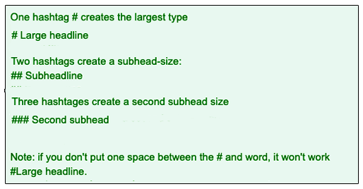
It's done with the hashtags # - and requires one space after the hashtag/s.
Note: the hashtag in this instance creates the headline font, not be be confused with hashtags on social media.
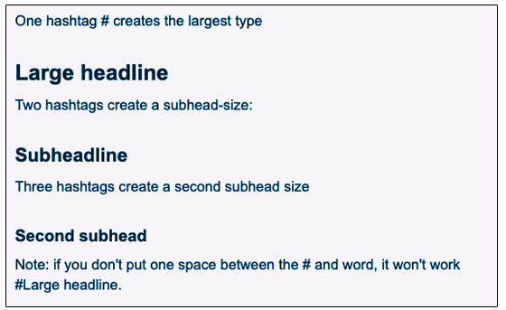
See how these hashtags (in the image above of the edit window) apply to the published text on DG (in image below of the published window).
Here's a side by side comparison:
Left side: edit window – Right side: published window
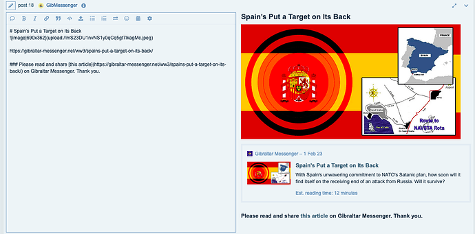
Here's another example:
One of Gibmessenger's post to compare what is in the edit window and what is published:


